Oct
20, 2014
Ebola
Chart 4The plots for Sierra Leone and Guinea reflect laboratory confirmed cases of Ebola only. For Liberia, however, because, the great majority of cases have not been confirmed by lab test, the plot is of total cases, comfirmed, probable and suspect.
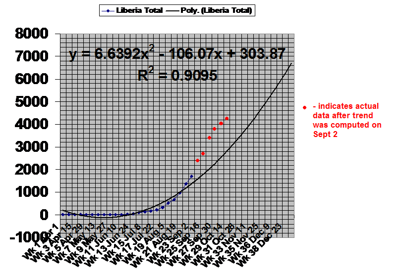
Trend lines were developed in Ebola Chart 3 to predict the course of the outbreak in each country up to the end of the year. The trend lines were developed using data up to Sept. 2. These trendlines are reproduced here, but with the new data points since Sept. 2 included. The trendlines have NOT been recomputed using the new data.
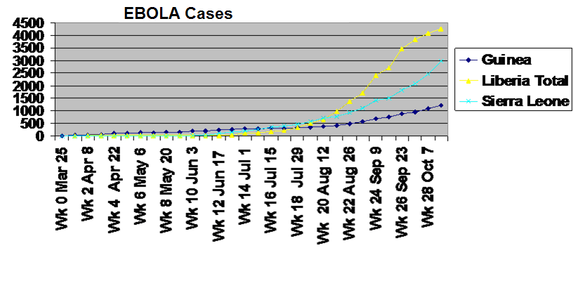
The chart above shows the continued increase in Ebola cases in the three worst affected countries. The Guinean rate of infection has increased markedly over the last six weeks, although it is still lower than the other two countries. The chart appears to indicate some slowing in the Liberian rate of infection, but the WHO maintains that this is only because data collection is not accurately reflecting the actual situation.
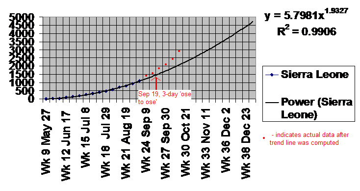
The chart above shows the trend line computed on Sept. 2 for Sierra Leone and the actual data points collected since then. The new data shows that Sierra Leone's infection rate has increased since Sept. 2. It is not clear whether this increase is linked to the 3-day 'ose to ose' campaign launched on Sept. 19.
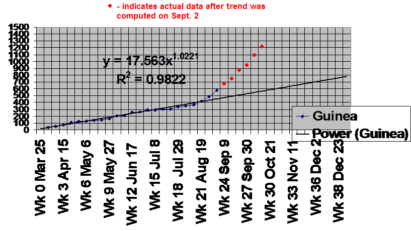
The chart above shows the trend line computed on Sept. 2 for Guinea and the actual data points collected since then. The new data shows that Guinea's infection rate has increased since Sept. 2. This is especially disappointing as Guinea, with a more robust contact tracing effort than the other two countries, had at one point some weeks ago appeared to be gaining the upper hand in the fight against Ebola.
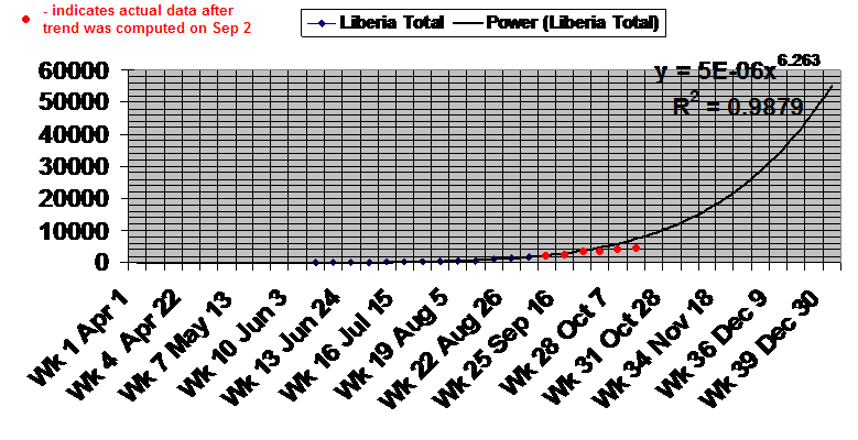
The chart above shows one of two trend lines computed on Sept. 2 for Liberia and the actual data points collected since then. The new data appears to indicate that the trend is overly pessimistic, although the WHO is saying there are a large number of unreported cases from Liberia.
